uTalk
Official forum for Utopia Community
You are not logged in.
- Topics: Active | Unanswered
#1 2026-05-12 05:43:03
- Firehell
- Member
- Registered: 2025-09-18
- Posts: 55
Concept for a cleaner, grouped Settings menu for Mobile
Hey team,
I was comparing the Utopia mobile settings to some other modern apps, and I have a suggestion to make our interface feel a lot more "pro" and organized.
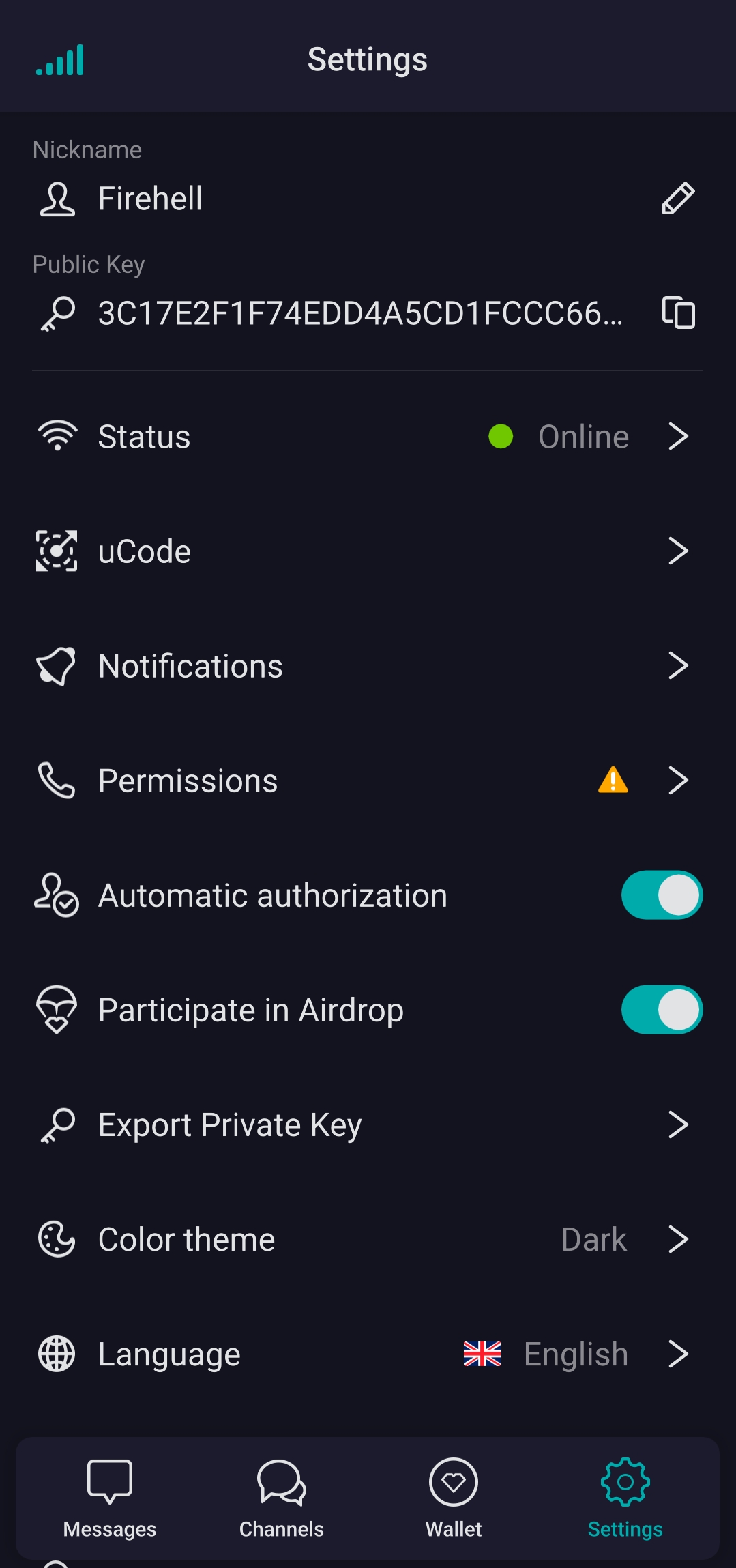
Right now, our settings are in one long list, which can feel a bit overwhelming. I’ve attached some screenshots to show a better way to do it—by grouping related settings into separate sections.
For example:
• Section 1: Account, Profile, and Bio.
• Section 2: Chat Settings, Themes, and Stickers.
• Section 3: Privacy & Security.
• Section 4: Notifications and Sounds.
By putting these into their own "bubbles" or separate blocks, it makes the app look much more unique and helps users find what they need instantly. It takes away that "normal" list feel and makes the whole ecosystem look high-end.
What do you think about updating the settings UI to this grouped style? I think it would be a huge improvement for the overall look and feel of the app!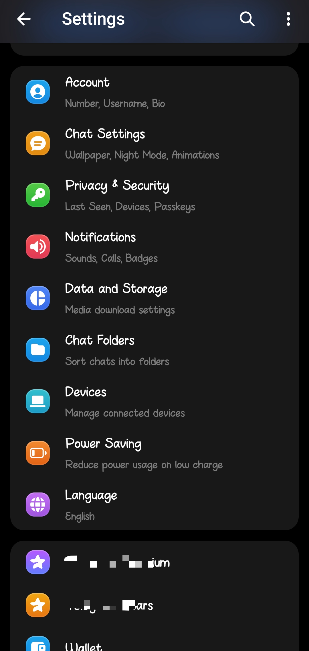
Offline